![]()
 C
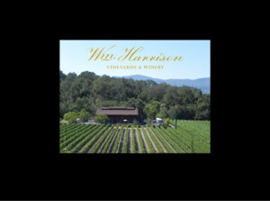
C![]() lub Member book for a small family owned winery in St. Helena, Napa CA. I photographed and designed the book. Also responsible for print quotes and oversight.
lub Member book for a small family owned winery in St. Helena, Napa CA. I photographed and designed the book. Also responsible for print quotes and oversight.
High-end design, photography and print job for Securities Industry Automation Corporation (SIAC – a subsidiary of the New York Stock Exchange). This Capabilities Publication is similar to an Annual Report. It was 36 pages plus cover, 9″ x 12″. I designed this piece with a pocket on the inside back cover so a select assortment of inserts could be included as necessary. I hired the photographer and scheduled the shoots with the “models”, mostly comprised of SIAC and NYSE staff. I was responsible for design, layout, photography scheduling, execution and print management. Photos have spot uv-lamination.
As one of the organizers of Vallejo Open Studios, I had the fun opportunity to design our first Annual Report. I created two versions – one for print, which was a 2-sided, letter size piece. To encourage recipients to read on, this was the subject line in the Mailchimp e-newsletter: “Curious about what we did with all that money we collected last year?” It worked. Readership on this e-newsletter was the highest we ever had.
Standard letter size brochure (8.5″ x 11″). 8-page, self-cover brochure for a telecommunications reseller that provided special phone lines for financial trading. CAP, Common Access Pathway, was a service provided by the New York Stock Exchange (NYSE). I had a generous budget for this project and was able to incorporate metallic inks for gold and blue spot colors used throughout to give it a sophisticated and expensive look. CAP was a new and exciting service and they wanted that reflected in the design of the brochure. I was responsible for all art, stock images, design, layout and print management.
After designing the company’s logo, I was asked to design their product brochure. I also rewrote all the text from a draft submitted by the seller at his request. This is an 8-page letter size brochure, full color. I created the cover image from two stock photos. I blurred the background photo for an abstract feel. The foreground photo was retouched to color the globe. I also made part of this photo partially transparent so that the background photo would show through the top photo, but not through the arms, hands or globe. Many of the photos inside were stock images that I researched and purchased for them. I was responsible for the concept, copy editing/rewriting, art and stock images, design, layout and print management.
This is the cover of a 25 year anniversary brochure I designed, layed out and oversaw printing for a company I worked for in New York. I got a list of all the employees in the company from Human Resources and formatted it so that there was just a single space between each name. Then I played with size, linespacing and kerning (space between letters) to fit the names on the front and back covers. These were silver foil stamped as well as the number 25 in the special logo I designed for this occasion. I also was involved in determining content, which included items from 1972, the year the organization was established. This included a collection of old photos, and old newspaper items such as a crossword puzzle and the TV listing. We all had a lot of fun making this book and it was a huge hit with employees.
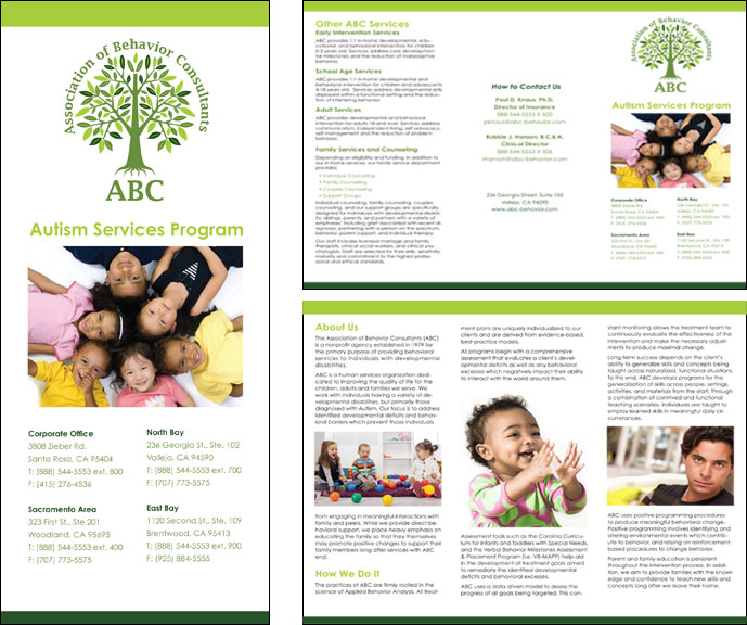
 Tri-fold brochure for Association of Behavior Consultants, a group who work with children with autism. Stock photos were used for client confidentiality. Designed using Adobe inDesign. Printed on 100# cover stock to provide a sturdy feeling.


