This logo was created 20 years ago. Classic designs will always stand the test of time. This was for a very talented construction worker, who while not that old, is well known for the almost lost art of repairing old plaster walls entirely by hand and leaving a perfectly level, smooth surface. Created using Illustrator.
Innovative Energy Solutions was a startup business whose main focus was installing solar energy in homes and commercial buildings but with a promise to become much larger. The logo had to convey a “green” mindset and a feeling of energy. I also used the arrow as a symbol of moving forward.
This noodle house was changing its name and overhauling its menu. Although designed as a multi-purpose image, it was predominantly used for signage and menus. The budget was very small. Created in Illustrator. Bowl and small dish are stock images. I also created their menu and table numbers.
The owner of Vallejo Boat Works runs a meticulous business and is himself a very visual person. After my initial sketches, we sat side by side and worked out every line of this drawing based on the clean lines that he loves in boats. Created using Illustrator. Font was selected by the client.
Leonardo Cycles creates custom batteries for electric bikes. This is the full logo used on letterhead and their business cards.
 A variation on the logo to be used for postcards.
Self stick label design for the front fork which will be printed in various colors to complement the color of the bikes.
The owners of Floor Dimensions came to me for artwork for an ad, and while they were visiting they mentioned the new sign they were having made. They happened to have a sketch of it and after offering my advice they asked me to create the art for them.
Sisters Improving Self is a non-profit organization of women who get together and work at bettering their own lives and that of each other’s in whatever form that may take. The group wanted to represent a variety of women of color. I started with a sketch, then redrew and colored the image in Illustrator.
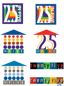
Logo options for Bank of America’s project for Habitat for Humanity. The goal was to build five houses in 5 years. I represented the concept visually as well as in text.
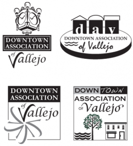 Several designs submitted for the Downtown Association of Vallejo logo. I typically design in black and white initially to allow clients to focus on form. Color options provided later.
 Logo for a real estate/mortgage company. The business owner had a clear idea of what he wanted. My job was to make it come to life for him.
 Logo and signage mockup for Dead Peoples Stuff. The store specializes in estate sale items that are restored or reinvented. The diagram below is to scale and represents how the building is painted. This enabled the store owners to understand how the proposed vinyl signage would look. Once approved, I created the art, and worked with the signage vendor to have it created and installed.

