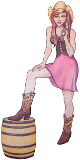
Sonoma/Napa Winemaker Jim McMahon asked me to design a label for a new pinot noir rose he created. The name “Boot Leg” just seemed to scream for a sexy leg somewhere in the design. Jim and I discussed various options as I submitted some pencil sketches to him. Eventually I came up with this illustration that Jim approved.

We agreed that I would do the final art in color pencil, which I find fun to work with and easy to control. Color pencil provides different levels of texture or smoothness depending on the paper you use. I used tracing paper to get a smooth look and began by tracing my sketch with a permanent black ink pen. I poured over images of Western boots and came up with this design Jim and I both liked. I kept it open and simple to be sure the detail would not be too small to notice.
Then I began “coloring” the inked drawing with color pencils.

After scanning my color illustration, I began the layout. I used two stock photos to created the background fence and dirt floor. Then I viewed about 1,000 typefaces and selected one with a casual flair and one which complemented the rustic feel of the image. My starting point was to use the entire cowgirl illustration. Here is the result.
I thought it looked great, especially with the name matching the pink in the cowgirl’s skirt. The warm pink really popped from the cool tones of the fence. Just to make sure, I gave it a drop shadow. This was one of the few times I chose to use a drop shadow in a design — I think it tends to be overused. Anyway, I added the year, name of the wine and region. I thought about making that text a little larger, but the winemaker, Jim, liked it as is, so we left it. When a client feels strongly about something after discussion, I leave it to their judgment. The fun was in the name of the wine, after all.
I have learned not to stop when I think a design is good enough, but to push a little further and try other options even if I end up with my first design, that’s okay. So I enlarged the cowgirl a little and cropped it a bit with this result.
Now I was getting somewhere. Boot Leg really requires focus on the “leg”. So I decided to push it all out and focus only on the leg.
Jim loved it and so did I. Although it was a little tough to scrap the rest of the drawing, I know that good editing is everything!


